July 11, 2017
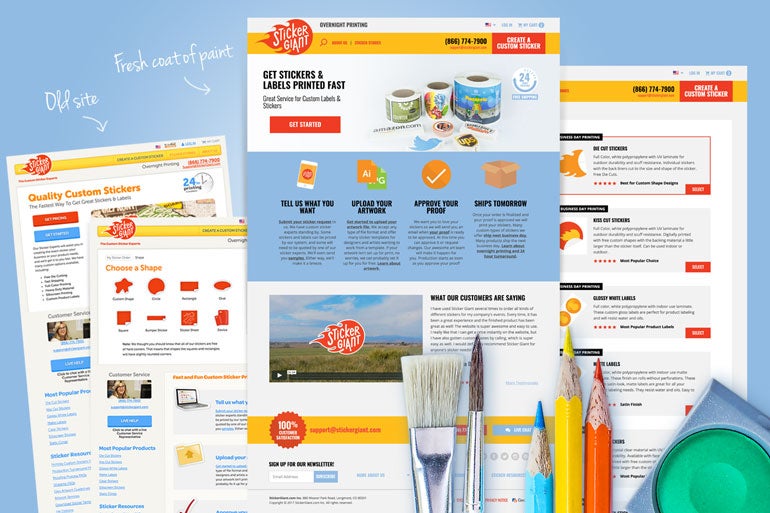
 We have a new look to our website which launched just two weeks ago. Did you notice? If you love data and it's relationship to design as much as we do, please read all about why we changed up StickerGiant.com.
The look and feel is sleeker and the user experience is easier. But there’s much more happening under the hood that got us to this new and exciting place. Let’s take a look.
Guesswork, out. Assurance, in.
We are all about metrics. And we love it. At our headquarters in Longmont, Colorado, we have an office where one wall is lined with monitors displaying website analytics in real time, called our Marketing Command Center. We focus on numbers and outcomes are unparalleled (in our experience) which makes it easy to know where our priorities are: our Customers. When we started initial designs, we knew each new design had to produce the same or improved website results to be “accepted” or implemented as part of the design update. Simply put, there was no option to go backward. Only forward. For example, if the page load was slower on a new design, we wouldn't implement it. If the click through rate was lower, we wouldn't implement it.“Analytics are everything to us at StickerGiant. We don’t just say they are important, we practice it all the time,” Jesse Freitas, Marketing Director at StickerGiant, said. “We meet as an entire company weekly on Tuesday mornings to review our Company Scorecard that has fifteen key metrics related to our business and operations. We make decisions and adjustments based on what the numbers tell us week to week.”The customer -- and therefore the customer experience -- is the priority, so only changes that improved the customer experience were used. No exceptions. With every new design, we had to know if the change improved the user experience. To track that we needed a baseline, which meant testing the original website, as well as the new designs.
Usability Testing: Click-through rates
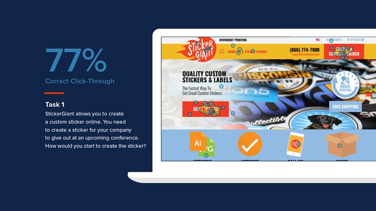
Over six months, more than 500 users performed 100+ tasks. The Bluespark project team created these tests -- or scenarios -- around specific designs and desired outcomes. The users were recruited through a user testing service. The desired outcomes were set using parameters, like a hot spot around a button we wanted clicked. If that link -- or somewhere in the hotspot -- was clicked, then that scenario was calculated as a success. Here is one of the tasks we designed: “StickerGiant allows you to create a custom sticker online. You need to create a sticker for your company to give out at an upcoming conference. How would you start to create the sticker?” Using a previous StickerGiant webpage, we received a 63% correct click-through rate. When we tested the new design, we received a 77% correct click-through rate. Therefore, we chose to implement the new design.
Ecommerce: Reduce distraction, focus on conversion
While customer experience, relevant content, and product quality are all critical to our business, the success of any ecommerce business is tied directly to its website conversions on both desktop and mobile. Everything else can be great, but if customers don’t get to the part involving their own stickers, we have a problem. In one testing situation, this meant reducing content and therefore, distractions. On the previous version of the site the pages were very long and there were many links and buttons. We simplified the calls-to-action (CTAs) so that we could guide you through the experience of purchasing a custom sticker without getting distracted by all of the other things that were around it.“If they get distracted and click on something, they've now been taken away from the one thing we want them to complete. By reducing that, we're giving them more focus on what we want them to do, which is order a new sticker, and actually check out with it,” Mark said. (Mark is an awesome UX designer for Bluespark).By taking the longer pieces of content and putting them in an expandable footer, we shrunk the page significantly.
 Now that our new website is live, user interactions are live, too. So, the Bluespark team and Team StickerGiant are closely monitoring real-time data to ensure forward progress.
“We are watching to see if the CTR improves like the testing showed us and whether there is a big increase in conversions as a result of people getting through the cart online,” Jesse said. “At the end of the day, we expect to see an increase in daily and weekly leads through the website, ultimately leading to more beautiful custom stickers and labels being run through the shop.”
The Bluespark team will look for more engagement on landing pages, longer time views on the videos, increased click through rates (CTRs) on the actual "create a custom sticker" button, and more conversions on the actual stickers.

