December 20, 2022
 There are times when you need clarity in your branding and messaging, and that time calls for a clear label.
Clear labels are some of the most versatile products we offer, with opportunities to let your brand shine through increased brightness and visibility. To get this type of label design optimized, however, you need to do a few things.
As you can see on the
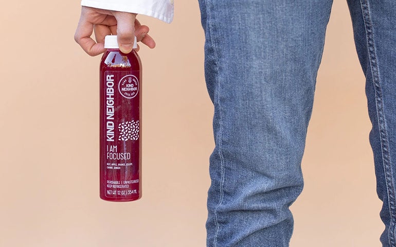
Tips For Setting Up A Clear Label
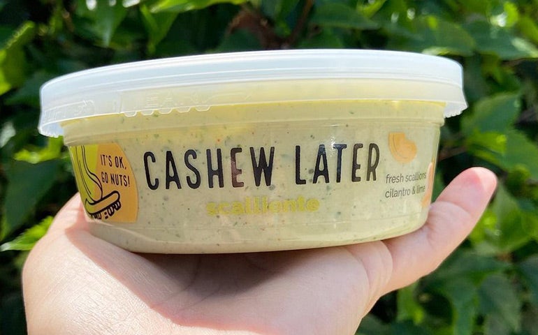
Clear products will print best with vector images, where a white layer of ink can be added behind your design, without interfering with your design and brand. This is needed to create an opaque layer that helps your colors pop. You can see this in play in the Cashew Later labels below. There is the red-and-yellow and the green-and-yellow sections of the label that really pop, but there is also a section of the label that is just clear with black text. The UPC symbol on the secondary label to the right in the photo has a layer of white to make sure that the code will scan at the point of purchase. This label mixes both color and transparency to create a bold piece of branding.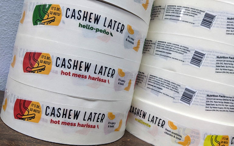 In the image below, you can see what the label looks like when it's applied to the product. The color of the dip itself really shines through the label because of how the design is built. Mixing color, text and different shapes helps this label design promote the product, while not overpowering the experience for the customer.
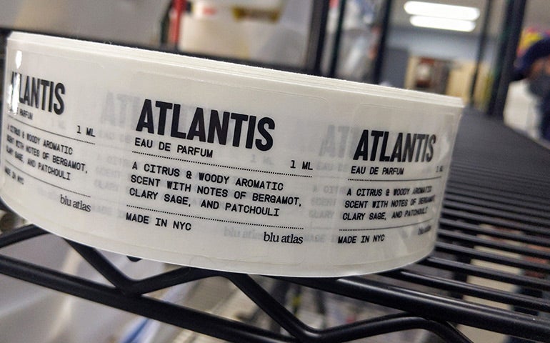
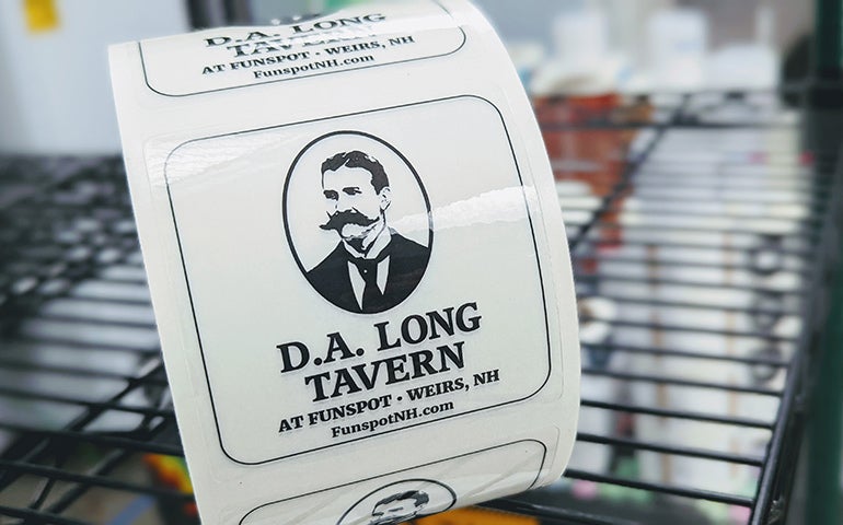
 Other ways to use clear labels include focusing just on black-and-white typography, like in this cologne label and the tavern label below.
On this blu atlas eau de parfum label, it's a small square that attaches to a 1ML bottle, and the all-caps typography helps with legibility in a small scale. In all of these label use cases, the beauty of the clear label itself is that the edges are nearly seamless, and you can't see where the edge itself ends, so it blends into the container.
 In this D.A. Long Tavern label, black and white are again the featured colors, but there is a design element of the person's face. This label setup allows for the clear substrate act as a platform for the artwork and the typography to showcase this brand.
 If you're looking to learn more about how to set up clear labels, or how to apply clear labels, we have many resources on the website and our customer support team is ready to answer any questions. We have free custom shapes for your designs, and our clear labels are designed for indoor use with a moisture resistance, so you can be sure that they will hold up in cold cases and on windows.
TRY CLEAR LABELS